Recently I received a question on Discord about how to determine which is the proper font to use to make sure it looks exactly as the creator perceived it at the time. The answer was lengthy and since I received a few responses that the information should be safeguarded I’m creating a post here. Feel free to continue the conversation here.
quite likely there is no easy answer to your question and to understand this you might need a little history on the topic. You also need to know that ANSI escape sequences are not limited to a certain platform, they are sequences created for textmode consoles, vendors may have left out some parts of the standard or slightly modified it. whatever is preserved in artpacks on 16c is mainly created on IBM PC using the Microsoft ANSI.SYS driver for MS-DOS or for the Commodore Amiga which also uses the ASCII set but looks different. Both platforms have their own limitations and specifics and next to them ANSI is also being used elsewhere on Linux terminals using custom 24-bit color sequences for example.
so in the beginning the hardware was defining factor for how characters were displayed, and if you’d call an Amiga BBS from a MS-DOS terminal, you’d obviously see the textmode art they created in the IBM PC codepage and not in the Amiga version. More often than you’d think PC users were thinking this how it was supposed to perceived 
Nowadays a textconsoles are mostly graphical, but back in the day the text console was implemented in hardware, directly in the display adapter, as the system needed to be able to show output directly from bootup. One big different with CRT monitors and the LCD’s introduced in the early 2000’s are the shape of the pixels. The CRT monitors had rectangular pixels and were about 35% taller than the pixels you’re used to see in this day and age. This means we need to stretch artwork output vertically when displaying artwork that was created before approximately 2000. We can’t be sure who started using Windows and LCD monitors at what point exactly but 2000 is year 16c uses as a limit where to stop using legacy aspect ratio for output. everything created before 2000 uses aspect ratio and everything afterwards assumes modern aspect ratio. 16c allows manual override for any of the display settings, so individual corrections are possible.
But to make the aspect ratio story even more complicated, during the nineties artgroups started creating viewers and editors (notably ACiDdraw) that offered a VGA preview mode which did not account for the stretching in the hardware text console. So artists would look and even create their artwork in textmode, but use the VGA preview mode to check for proportionsfor example, it became increasingly more important for artwork to look good in VGA mode too from 1994 onwards. this is why 16c assumes legacy aspect for the atwork prior to 2000 for the ‘main image’ but uses modern aspect ratio for the thumbnail and previews as this is how it as perceived in viewers and editors at the time.
Another item that affects display of the PC ANSI is the letter spacing. Characters where 16 pixel tall and 8 pixels wide, but a 9th pixel was added to allow spacing in between characters. This was done in hardware and the hardware also knew which characters had to connect horizontally (like line characters) and would generate the pixels accordingly in the right places so that the lines wouldn’t not get interrupted in between characters. As this letter spacing was done in the display adapter, it would only appear on a hardware text console. These text consoles became also mostly out of use around 2000. From there onwards, character width in for example a Windows DOS prompt would be 8 pixels wide. And displaying older artwork would change proportions. Again 16c assumes 9px for artwork created prior to 2000 and 8px for 2000 onwards. This is where we’ve drawn the line, but we can’t always be sure if the user was using a text console or a graphical user interface on the turnover of the millenium.
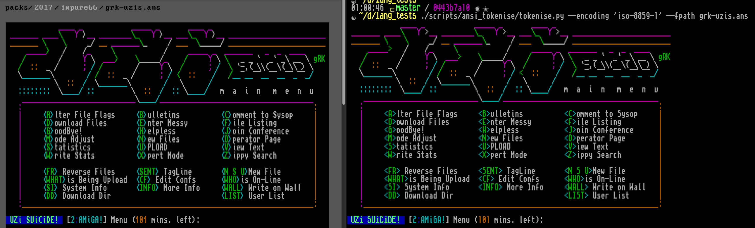
Apart from the displaying paramters, it’s also noteworthy that the extended ASCII set exists in several codepages created by IBM which allowed for character localization. The most common one being codepage 437 as used in the USA or codepage 850 as used in Western Europe. Viewing artwork created in one codepage would display differently in another codepage, although when talking about ANSI art, the effects will be minimal as this was usually for the alphabetical characters, which were typically not used to create art, but there are exceptions like ‘newschool ascii’ art. Also, Microsoft decided to get rid of the certical halfblocks (replaced by a pipe) starting from Windows XP iirc. You needed to load another driver if you wanted them to displayed properly on the DOS prompt.
The SAUCE metadata systems exists since 1994, but the support for font specification was added in 2012. While not so much ANSI art was created in 2000 and 2012 we’re mostly uncertain in what way the artist created the artwork. Some even mention it directly in the artwork, others are sometimes careless or assumed that the viewer would be aware it would need to be displayed in a certain font.
If you want a single answer on what font should be used for which artwork, the answer is not very straightforward, it depends on when it was created, in which resolution you would be viewing and even then you need to make assumptions as metadata is not always available. 16c has strived to make display historically correct and for now I think we succeeded as the criticism on this part for former web galleries seems to have faded over the last years.
If your intention is to display legacy ANSI artwork in a Unicode terminal, you might be out of luck. You’ll always be fighting with character dimensions (eg the 35% vertical stretch) and the letter spacing, which are items you have no real control over, a users really decided himself on the specifics of a terminal in a graphical environment. And that is also the most important reason for 16c to display ANSI art in PNG format as it allows to display it as close to the creation as possible.
Some additional backgorund information (and illustrations) about Legacy Aspect and Letter Spacing can be found here: 16colo.rs